Squeeze Page: What It Is, How It Works, and When a Funnel Beats It (2026)
A squeeze page is a landing page built to collect one thing: an email address. What goes on one, the conversion numbers that don't survive a source check, and why phone ad traffic often needs a short funnel instead.
 Faheem MushtaqCo-Founder & CTO
Summarize this article with
 ChatGPT
 Claude
 Perplexity
 Grok
GrokA squeeze page is a landing page with a single goal: getting a visitor to hand over their email address, usually in exchange for a free resource. It has no navigation, one short form of one or two fields, and one button. Wikipedia's definition is the cleanest: a squeeze page is "a landing page created to solicit opt-in email addresses from prospective subscribers."
The format is older than most of the traffic it now receives. Squeeze pages were designed for visitors who arrived from a search result or an email, usually on a desktop, already looking for the thing on offer. In 2026, most people who reach one tap through from an Instagram, TikTok or Facebook ad on a phone. That's a different visitor, and it changes what the page has to do.
Key takeaways
- A squeeze page asks for exactly one thing. An email address, sometimes a first name, with every exit link removed.
- It's a type of landing page, not a synonym for one. Every squeeze page is a landing page. Most landing pages are not squeeze pages.
- The conversion rates quoted for squeeze pages are anecdotes. One vendor's own ebook page converted anywhere from 25.46% to 65.67% depending on the market it ran in, using the same tactics.
- On a phone, the one question a squeeze page asks is also the costliest. An email field opens the keyboard before the visitor has received anything.
- For cold paid social traffic, a short funnel that asks a couple of tap-to-answer questions before the email is often the better fit. For warm traffic that already wants the resource, a squeeze page is still the simplest correct answer.
What is a squeeze page?
A squeeze page is a standalone landing page that exchanges a free offer for a visitor's email address. It removes navigation, sidebars and outbound links, so the only two actions available are opting in or leaving. The name comes from "squeezing" the address out of the visitor.
The classic squeeze page has five parts:
| Element | Its job |
|---|---|
| Headline | States the offer and who it is for, in one line |
| Supporting line or bullets | Makes the value concrete enough to justify the trade |
| Visual of the offer | Shows the checklist, guide or video being given away |
| Opt-in form | Email, sometimes first name. Nothing else |
| Consent and privacy line | Says what the visitor will receive and how often |
Wikipedia notes that navigation and hyperlinks are "almost always absent", and that privacy statements became part of the format as people grew more cautious about giving out email addresses. The page is deliberately short. The less there is to read, the less there is to disagree with.
Squeeze page vs. landing page: what's the difference?
A landing page is any page built for one campaign goal, whether that's booking a demo, starting a trial, registering for a webinar or buying a product. A squeeze page is the narrowest kind of landing page: its only goal is email capture, and its form rarely has more than two fields.
| Squeeze page | Landing page | |
|---|---|---|
| Goal | Collect an email address | Any single conversion: demo, trial, purchase, booking |
| Form | One or two fields | Anything from none to a full application |
| Length | As short as possible | Varies with the price and complexity of the ask |
| Navigation | None | Usually none, sometimes minimal |
| Where it sits | Top of the funnel | Anywhere in the funnel |
| What you learn about the lead | An email address | Depends on the form |
Two other terms get used interchangeably with squeeze page:
- Opt-in page is effectively a synonym. It usually implies a newsletter or content subscription.
- Lead capture page is broader. It includes pages that collect a phone number, a company name or qualifying answers, which a strict squeeze page would never ask for.
If you're weighing the wider landing-page decision, our guide to what makes a high-converting landing page covers the full structure.
Do squeeze pages still work?
Yes, when the visitor already wants the offer. A squeeze page is the lowest-friction way to capture someone who arrived looking for exactly the resource you're giving away. It struggles when the visitor is cold, because it asks for the email before it has given the visitor any reason to trust the page.
That split is the whole story, and it's why "squeeze pages convert at X%" is the wrong question. Who arrives decides the rate more than the page design does, which the next section shows with the category's own numbers.
One historical note matters if you plan to rank the page itself. Wikipedia records that Google's Panda and "Farmer" updates in 2011 began treating thin squeeze pages as low-quality content, and marketers responded by adding content to them. A squeeze page is built for paid, email or social traffic. It is not an SEO asset, and it shouldn't be.
What is a good squeeze page conversion rate?
There's no well-sourced benchmark for squeeze pages specifically. The figures that circulate are either single examples or averages for landing pages in general, and the spread between them is too wide to be useful as a target.
Here's what the pages ranking for "squeeze page" actually cite, checked at the source on 17 September 2026:
| Figure | Where it comes from | What it actually measures |
|---|---|---|
| "Over 35%", "over 41%", "over 40%" | Unbounce's squeeze page guide | Three individual example pages (Officevibe, Bariatric Eating, Herbaly). No sample, date range or traffic source stated |
| 10.76% | GetResponse, citing its Email Marketing Benchmarks report | Average for landing pages across all industries on GetResponse. It isn't squeeze-page-specific, and it ranges from 39.93% (Restaurants & Food) to 0.7% (Retail) |
| 25.46% to 65.67% | GetResponse's own localized ebook squeeze page | The same page and offer, run in different markets "using the same marketing tactics" |
| 6.6% | Unbounce Conversion Benchmark Report | Median across 41,000 landing pages, 464 million visitors and 57 million conversions, Q4 2024. All landing page types, not only squeeze pages |
The most useful number on that list is GetResponse's range, and it's the least quoted. One squeeze page, one offer and one set of tactics produced conversion rates 2.6× apart, depending only on who saw it. If the audience alone can swing the rate that much, a benchmark from someone else's audience tells you very little about yours.
What you can compare against, honestly:
- Your own previous version. Change one thing, run the same traffic source, and compare.
- The traffic source. Ruler Analytics' 2026 data puts paid social at 2.11% against paid search at 5.4% across whole-site sessions. A squeeze page fed by Meta ads and one fed by Google search are not competing in the same race.
We cover the denominators behind these benchmarks in detail in what the average landing page conversion rate actually is.
Why do squeeze pages struggle on mobile ad traffic?
Because on a phone, the only question a squeeze page asks is the most expensive one it could ask. Typing an email address means opening the keyboard, and that happens before the visitor has received anything or answered anything easy.
Four measured facts point the same way:
- Most traffic is mobile. Statcounter put mobile at 52.57% of global web traffic in July 2026, and paid social skews much further toward phones than the web average.
- Forms complete less often on mobile. Zuko's benchmarking puts view-to-completion at 47% on desktop, 42% on mobile and 41% on tablet.
- The email field is one of the most abandoned fields. Zuko's field-level data puts mean abandonment at the email field at 6.4%, behind only password (10.5%) and just ahead of phone number (6.3%).
- Field count is not the lever. Zuko's own conclusion is that the "number of form fields is not necessarily correlated with completion rate." The effort a visitor can see, and when they're asked for it, matters more than the total.
Put together: a squeeze page shown to a cold phone visitor opens with its hardest request. Removing fields doesn't help, because there's only one left. What can change is when the email is asked for.
The full breakdown of where forms lose people is in our form abandonment statistics.
Squeeze page vs. funnel: which should you use?
Use a squeeze page when the visitor already wants the offer. Use a short multi-step funnel when the visitor is cold, on a phone, or when you need to know more about the lead than an email address.
| Situation | Better choice | Why |
|---|---|---|
| Existing email list, newsletter readers, podcast listeners | Squeeze page | Intent is already established. One field is the least they can be asked |
| Search traffic looking for this exact resource | Squeeze page | The query did the qualifying |
| Cold Instagram, TikTok or Meta ad traffic | Funnel | Easy taps first build momentum before the email is asked for |
| You need to know budget, role, timeline or goal | Funnel | A squeeze page can't qualify without becoming a long form |
| Sales will follow up personally | Funnel | An email with no context gets worked blind |
| You're only growing a newsletter | Squeeze page | Qualifying questions add effort for no downstream use |
The funnel version doesn't remove the email request. It moves it — and it changes what the visitor is looking at while they decide. A squeeze page is a document with one field on it. The funnel version is a sequence of full-screen steps answered by tapping image tiles or dragging a slider, with the keyboard held back until there's a result to send. That difference is not decoration: the visitor arrived from a full-screen app, and the page they land on is judged against that, not against other web pages. The visitor answers two or three questions by tapping, like their goal, their situation and their timeline, and the email is requested at the moment something personal is ready: a result, a plan or a recommendation. By then the visitor has started something and has a reason to finish.
Unbounce's own squeeze page guide contains an example of this, although it doesn't label it as one. Herbaly's page asks visitors a series of 13 dietary, fitness and health questions and asks for the email in exchange for the results. Unbounce calls it an "interactive squeeze page" and reports it converting at over 40%. That's a single example with no stated sample, so it isn't evidence that quizzes beat squeeze pages. It does show that some of the best-performing "squeeze pages" in circulation are already funnels.
We don't know of a credible published study comparing the two formats head to head. Circulating claims that quizzes or funnels capture "5×" or "500%" more leads come without a stated method. Test both on your own traffic.
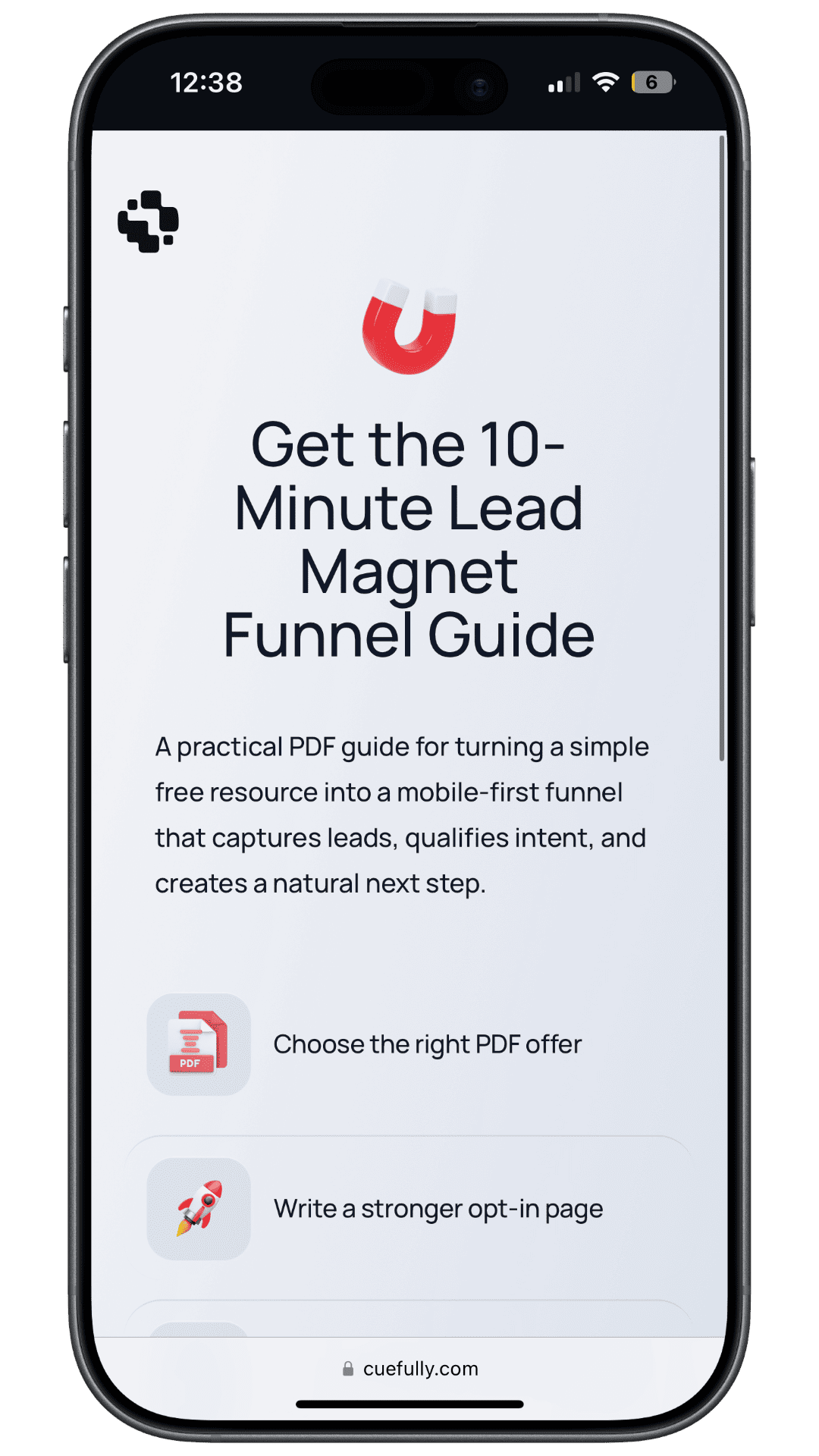
For the resource-led version of the funnel, see our guide to the lead magnet funnel. For why splitting a form into steps changes completion, see multi-step forms.
How to build a squeeze page that converts: 7 rules
- Make the offer specific to one person. "The 12-point pre-launch checklist for Shopify stores under $1M" filters better than "Free marketing guide." Specificity makes the trade feel fair.
- Put the whole value in the headline. The visitor should know what they get and who it's for without scrolling.
- Ask for the email, and only the email. Adding first name is defensible if you'll actually personalise with it. Anything beyond that means you should be building a funnel, not a longer squeeze page.
- Remove every exit. No navigation, no footer links, no social icons. Keep the privacy and consent line.
- Show the thing. A cover image, a checklist preview or a 20-second video makes an abstract offer tangible.
- Match the ad exactly. The headline should repeat the promise of the ad or email that sent the click. A mismatch reads as a bait-and-switch.
- Deliver instantly. Send the resource on submit and confirm on screen. Intent decays within hours, not days.
On a phone, add three more:
- Keep the form on the first screen. Nobody should have to scroll to find the field.
- Set the right keyboard. Use an email input type so the
@key is on the first keyboard layout. - Keep the page light. A cold visitor from a social feed won't wait for a heavy page to render.
How do you turn a squeeze page into a mobile funnel?
Keep the offer and change the order. The funnel version of a squeeze page is usually four to six screens:
| Screen | What it asks | Input |
|---|---|---|
| 1. Hook | The offer, framed as a question about the visitor's goal | One tap |
| 2. Situation | Where they are today | One tap |
| 3. Qualifier | The answer that decides what they're sent next | One tap |
| 4. Result preview | "Your plan is ready", personalised from their answers | None |
| 5. Email | Where to send it | Type once |
| 6. Next step | Book a call if qualified, otherwise confirm delivery | One tap |
The visitor types once, at the point where they've already invested three taps and can see what they're getting. You also learn three things about them that a squeeze page would never have asked.
CueFully is a mobile-first funnel builder designed specifically for Instagram, TikTok and Meta ad campaigns, and this shape is what it's built for. Funnels ask one question per screen and are answered by tapping. Branching logic sends each visitor down the path their answers call for. Answer-level scoring can route a qualified lead to a booking step. Copy can use the visitor's own earlier answers. Captured leads land in a built-in CRM with their source and answers attached. Analytics are per step, so you can see which screen people left on, not only that they left.
Our fitness funnel template is a working example of the pattern. It's a tap-through body-goal quiz that builds a personalised plan before it asks for the email. We measured its published page on 17 September 2026 from an iPhone Safari user agent: an 88 KB HTML document with a median load of 0.66 seconds across ten runs. If you'd rather start from a resource offer, the lead magnet funnel template follows the same order with a checklist.
Frequently asked questions
What is a squeeze page? A squeeze page is a landing page whose only goal is collecting a visitor's email address, usually in exchange for a free resource such as a checklist, guide or video. It has no navigation and a form of one or two fields, so the visitor can either opt in or leave.
What is the difference between a squeeze page and a landing page? A squeeze page is one specific type of landing page. A landing page can have any single conversion goal, such as a demo, trial, purchase or booking, while a squeeze page exists only to capture an email address with a one- or two-field form.
Is a squeeze page the same as an opt-in page? In practice, yes. Both are pages built to get a visitor to opt in to an email list. "Opt-in page" usually implies a newsletter or content subscription, and "squeeze page" is the more common marketing term for the same format.
What is a good conversion rate for a squeeze page? There's no reliable squeeze-page-specific benchmark. Published examples range from about 25% to over 65%, and GetResponse reports that its own ebook squeeze page ranged from 25.46% to 65.67% across markets using the same tactics. Benchmark against your previous version on the same traffic source instead.
Do squeeze pages work on mobile? They work on mobile when the visitor already wants the offer, such as email subscribers or search traffic. For cold paid social traffic on a phone, a short funnel that asks tap-to-answer questions first and the email last is often a better fit, because the email field opens the keyboard before the visitor has received anything.
Are squeeze pages bad for SEO? They're not built for search. A squeeze page is intentionally thin, and Google's 2011 Panda updates began treating thin squeeze pages as low-quality content. Drive paid, email or social traffic to a squeeze page, and use a full article or resource page for organic search.
What is the best tool to build a squeeze page for ad traffic? For a classic one-page squeeze page, any landing page builder such as Unbounce, Leadpages or Systeme.io will do the job. For cold Instagram, TikTok or Meta ad traffic on a phone, CueFully builds the funnel version: one tap-to-answer question per screen, the email asked for when a personalised result is ready, and leads captured with their answers in a built-in CRM.
Sources and method
- Wikipedia, "Squeeze page": definition, characteristics, and the 2011 Panda/Farmer note. Accessed 17 September 2026.
- Unbounce, "What is a squeeze page?": example conversion rates (Officevibe, Bariatric Eating, Herbaly), quoted as published. The page gives no sample, date range or traffic source for them. Accessed 17 September 2026.
- GetResponse, squeeze page beginner's guide: 10.76% all-industry landing page average from its Email Marketing Benchmarks report, and the 25.46%–65.67% range for its own localized ebook squeeze page. Accessed 17 September 2026.
- Unbounce Conversion Benchmark Report: 6.6% median across 41,000 landing pages, 464 million visitors and 57 million conversions, Q4 2024.
- Ruler Analytics: conversion rate by channel, 2026 data, whole-site sessions, conversion defined as a qualified lead or sale.
- Statcounter: device share of global web traffic, July 2026.
- Zuko: form completion by device and field-level abandonment, aggregated from Zuko's customer base. Zuko does not publish a sample size.
- CueFully fitness funnel template: measured 17 September 2026, iPhone Safari user agent, HTML document only, 10 runs, no cache.
Want the funnel version of your squeeze page? Start free with CueFully — no credit card required.
Build from the guide
Start with the Lead Magnet Funnel template
Start from a proven mobile-first flow, customize it for your client, and publish a funnel that captures qualified leads without adding developer work.