Lead Generation Landing Page Examples (With Full Funnels)
Four real lead generation pages checked in August 2026, the sequencing rules behind them, and one that breaks those rules and still works.
 Faheem MushtaqCo-Founder & CTO
Summarize this article with
 ChatGPT
 Claude
 Perplexity
 Grok
GrokA lead generation landing page is a single-purpose page that captures contact details in exchange for something the visitor wants: a report, a checklist, a quote, a call.
Most articles on this topic show a screenshot and a conversion rate. Neither tells you why anything was placed where it was, and that reasoning is the only part that transfers to your own page.
So: five rules that decide whether a lead generation page works, then four live pages judged against them. Two of the four you can walk through yourself.
The five rules that decide whether a page works
Almost every failure on a lead generation page is a sequencing problem, not a design problem. The ask arrives before the reason to answer it.
1. Give before you take. The first screen establishes what the visitor gets. A form above the fold, before any promise has landed, asks someone to pay for something they haven't seen.
2. Open with the easiest question. Visitors decide whether to start by glancing, in about a second, on appearance alone. A tap is a yes. A text field is a decision.
3. Put the hardest question in the middle, never first. Budget, timeline, phone number. Asked first they read as a filter. Asked once someone is invested they read as relevance. Most people get this wrong because the instinct is to qualify early to protect your own time. It costs you the people who would have qualified if you'd earned the question first.
4. Size the form to the offer, not to a rule of thumb. "Fewer fields always convert better" is the most repeated advice in this category and it isn't true. What matters is whether the ask is proportional to what's being given and how warm the audience is. Examples 1 and 2 below are the same kind of offer with opposite form strategies, and both work.
5. Say what happens next. Visitors hesitate when they can't predict the consequence of clicking. "You'll get the link immediately" removes that.
The four pages below are those rules applied, and in one case deliberately broken.
Example 1: Adapty, a benchmark report behind one gate
The page: State of In-App Subscriptions 2026
The offer is a benchmark report, and the headline says exactly what makes it worth having: "The only report with sub-category breakdowns for pricing, LTV, conversion, and paywalls, benchmarked against 16,000 apps with $3B in subscription revenue."
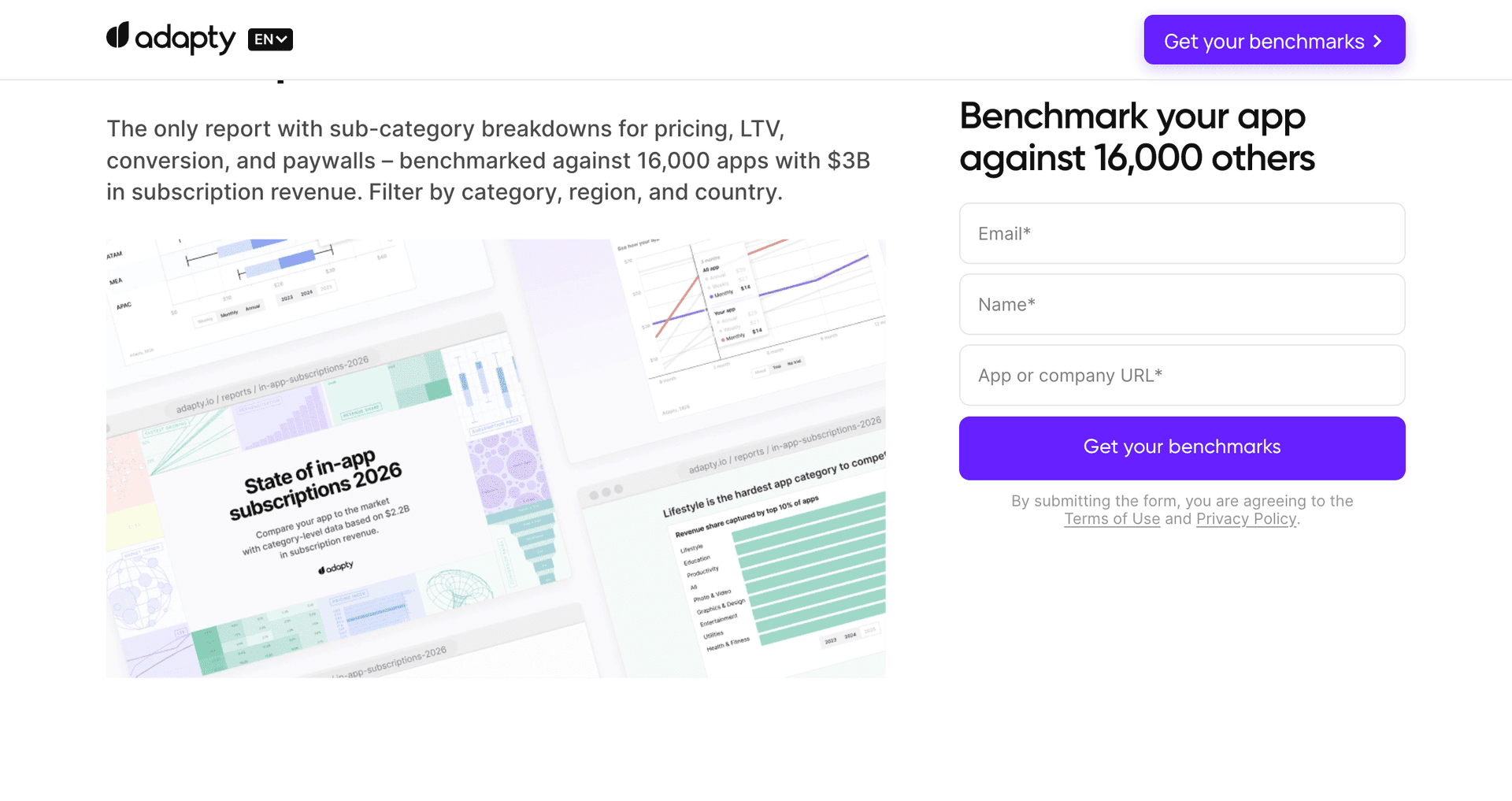
Why the ask can be light. The lead magnet is original research. 16,000 apps, $3B in subscription revenue, 105,000 paywalls compared. Nobody else has that data, which means the page doesn't have to work hard to justify a small ask. It gates the report behind a single step and lets the asset do the persuading.
Three details worth stealing:
- The CTA is an outcome, not an action. "Get your benchmarks," not "Download" or "Submit." The button describes what the visitor receives.
- There's an FAQ on the landing page itself. Unusual, and smart: it answers objections before the ask rather than after it.
- It recognises returning visitors. If you've already filled the form, the page tells you so and offers to resend the link instead of making you fill it again. Almost nobody does this, and it's the difference between a page that treats you as a record and one that treats you as a person.
Rules applied: 1, 2 and 5. The value is established before the gate, the gate is one step, and the page is explicit about what arrives afterwards.
What we'd watch: the page carries full site navigation and an eleven-language selector. That gives a visitor who arrived for the report several ways to leave. It's a defensible trade for a company running one page across many markets, but it is a trade.
Example 2: Unbounce, nine fields and it works anyway
The page: Conversion Benchmark Report
This is the same offer type as Adapty: a gated benchmark report from a SaaS company, backed by platform data (41,000+ landing pages, 464M+ visitors, 57M+ conversions).
The form strategy is the opposite. Checked in August 2026, it asked for: first name, last name, work email, company type, company name, number of employees, a comments box, a privacy checkbox and an email opt-in checkbox. Nine fields, one step. Full site navigation present. The CTA reads "Show me the full report."
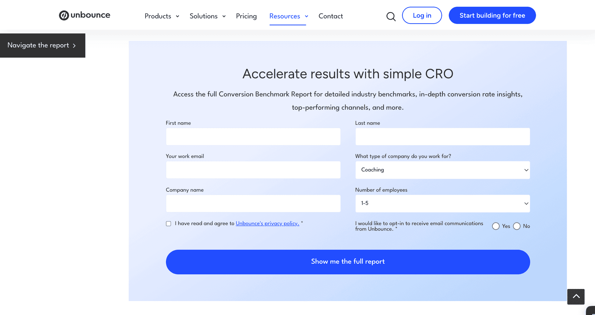
This breaks two things we just told you to do, and it's one of the most-linked pages on their site. So the honest question is why it works rather than whether it should.
Three reasons:
- The audience is warm and self-selecting. People who search for conversion benchmarks are marketers who already know what the report is. They aren't being persuaded from cold.
- The asset genuinely warrants it. A report built on 57 million conversions is not a two-page checklist. The ask is proportional.
- The fields have a job. Company type and employee count segment the follow-up. They aren't collected because a form builder made it easy.
Rules applied: 4, decisively. Rule broken: 2, and arguably 1.
What we'd change: the comments box. It's optional-looking, it's the only field requiring thought, and it sits in the middle of an otherwise mechanical form. On a page whose entire job is getting the report into someone's hands, it's the field we'd test removing first.
The lesson is rule 4. Adapty and Unbounce offer the same kind of thing to different audiences at different temperatures, and they land on opposite form strategies. Both are defensible. Anyone telling you there's a correct number of fields hasn't looked at enough pages — though the calculus changes once the click arrives from a phone, which is the case for choosing a mobile-first Unbounce alternative.
Example 3: a checklist that ends in a booked call
Walk through it: live funnel · template details
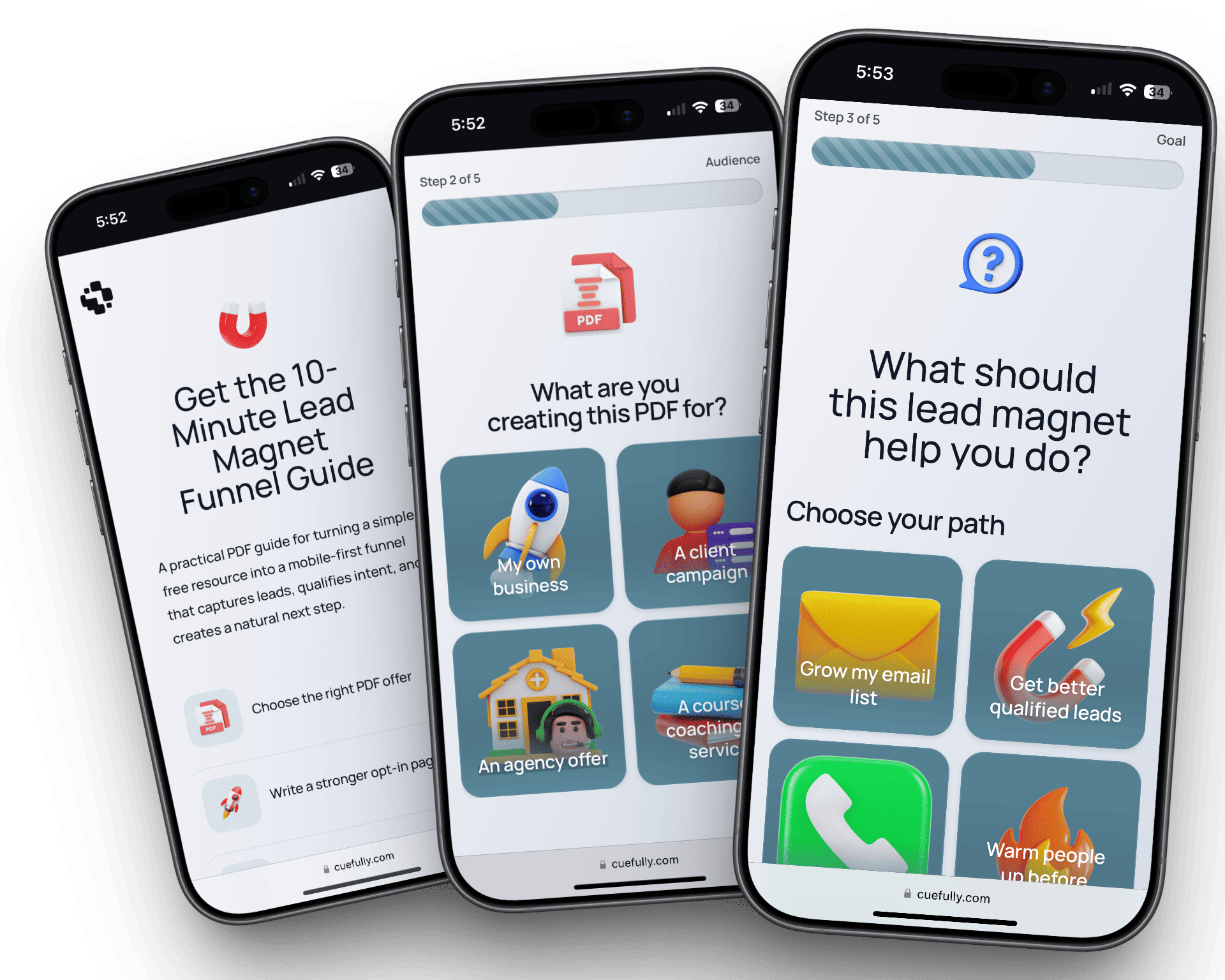
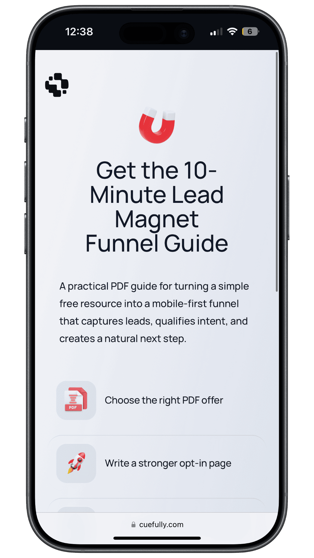
This is one of ours, so instead of describing what it looks like, here is why each decision was made.
The email is asked third, not first. The first two screens are the promise and what the checklist actually contains. The download is the trade, and the visitor needs to see what they're trading for before the field appears.
Qualification continues after the opt-in, which is the whole point. A static lead magnet page ends at the download and hands you an undifferentiated list. This one keeps going: what they're trying to achieve, where their traffic comes from, what's actually blocking them, how soon they need it solved. None of those are hard questions, and each makes the follow-up specific. Knowing someone's bottleneck changes what you say to them.
The question that decides whether to offer the calendar sits near the end, after five easier ones. Someone who has answered five questions will answer a sixth. Someone who has answered none will not.
Rules applied: 1, 2, 3 and 5.
What we'd change: the timeline and fit questions sit next to each other, and back to back they start to feel like screening rather than conversation. On cold paid traffic we'd separate them and move one after the contact step, so a hesitant visitor is already reachable before the hardest question lands.
Example 4: an offer that ends in an appointment
Walk through it: live funnel · template details
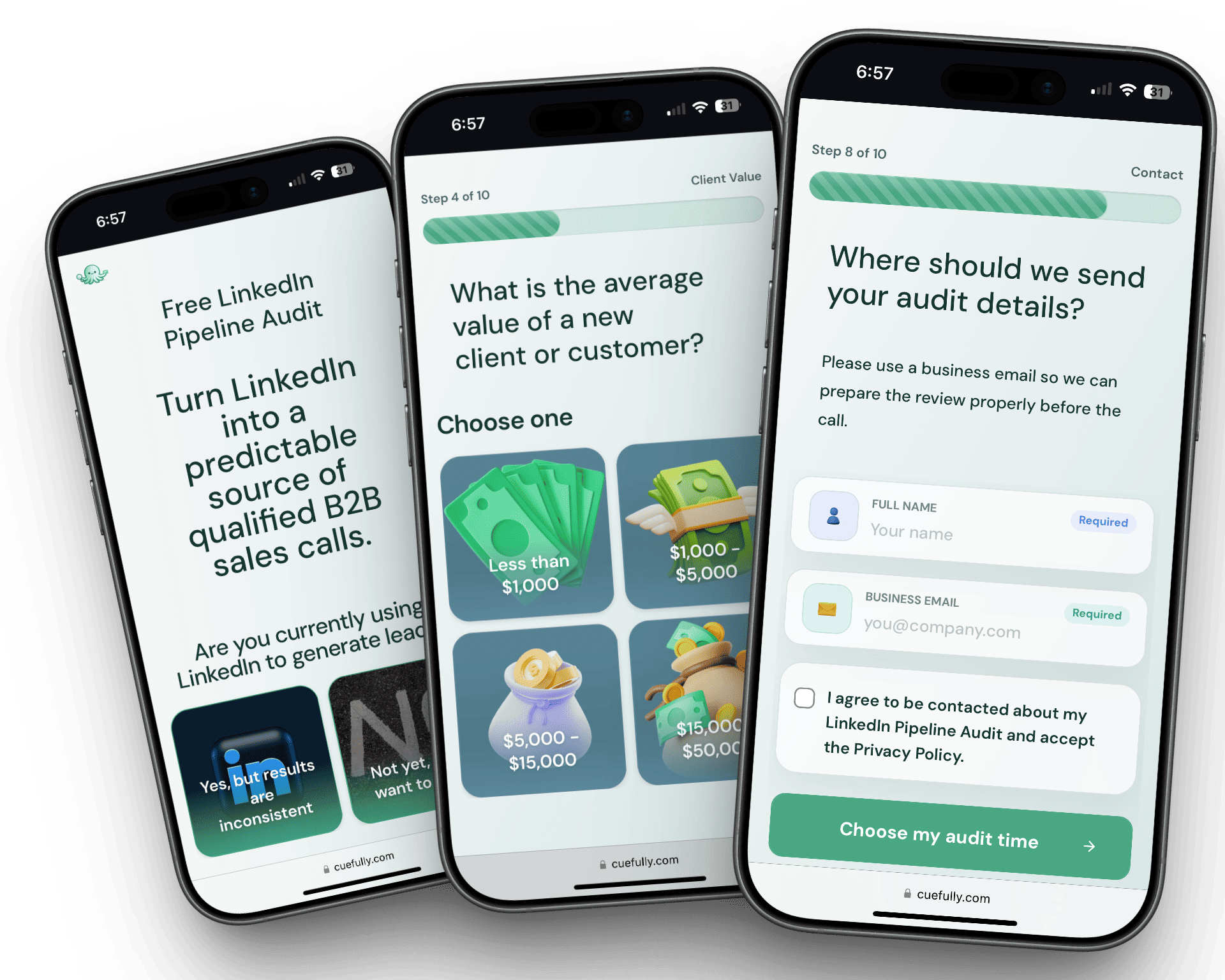
Different goal, same logic. The visitor already wants the outcome, so the page's job is to remove friction and keep out bookings you can't serve.
The calendar is not the first thing they see. Most booking pages open with one, which asks for commitment before explaining anything. Here the offer is explained, a few short questions establish whether the problem is one you solve, and the calendar arrives at the point the visitor is most willing to pick a slot.
The qualifying questions protect a scarcer resource than a form submission. Someone out of area, out of budget, or looking for a service you don't offer drops out before taking a slot you can't refill. An unqualified appointment costs an hour; an unqualified form fill costs a row in a database.
There's a step for people who don't book. They've answered the questions and given their details. Treating that as a failed conversion throws away a real lead, and most booking pages do exactly that.
Rules applied: 1, 2, 3 and 5.
What we'd change: budget sits earlier than we'd now recommend for a cold audience. For paid traffic with no prior relationship, we'd move it after contact details.
What the four have in common
Read across them and the same shape appears, regardless of offer or form length:
Two things stand out. Every page establishes value before asking, without exception. And three of the four keep site navigation, which nearly every landing page article tells you not to do. The rule is still right for a cold paid campaign; it's routinely ignored by companies running one durable page across many channels, and they're not obviously wrong.
The other lead generation page patterns
Beyond gated reports and booking flows, these are the shapes you'll meet most often and the characteristic way each fails:
The failure is the same each time. The size of the ask is out of proportion to what has been given.
What does every lead generation landing page need?
- A headline that continues the ad's promise. Message match determines whether the page works at all, and no amount of design fixes a mismatch.
- One offer and one action. A page with three competing calls to action is a homepage.
- Proof that fits the offer. Adapty leads with 16,000 apps. Unbounce leads with 57 million conversions. Specific and checkable beats "trusted by thousands."
- A stated next step. "You'll get the checklist immediately, no call unless you book one."
- A form sized to the offer, per rule 4.
Our guide to high-converting landing pages covers structure and the common mistakes in more depth.
Should it be one page or several steps?
For anything beyond an email capture, steps usually win. A single page shows the full cost of participating before the visitor has typed anything, and that glance is where most abandonment happens.
A multi-step form also gives you partial data. Someone who answers four questions and leaves has still told you their situation, and you can see which question lost them. An abandoned single page tells you nothing.
But note that Adapty and Unbounce both gate high-value reports behind a single step and neither is making a mistake. When the offer is strong enough and the audience is warm enough, steps add clicks without adding conversions. Steps earn their place when you need qualification, not when you simply have a lot of fields.
How do you build one?
- Decide the single action. Not "generate leads." Book a call, get the report, request the quote.
- Choose an offer worth the ask. If you want a phone number, give something that warrants one. If all you have is a two-page checklist, ask for an email.
- Write the opening line first. If you can't state the promise in one sentence, the page won't work regardless of design.
- List your real disqualifiers. Three to five things that genuinely mean you can't help someone. Those are your qualifying questions. Everything else is curiosity.
- Sequence it: easy, easy, hard, contact, confirmation.
- Build it phone-first. Most lead generation traffic arrives on a phone, from an ad.
- Measure per step. A single conversion rate can't tell you which question is costing you people.
Both of our examples are in the funnel template gallery, and the lead generation funnel guide covers the seven-step planning process behind them.
Frequently asked questions
What is a lead generation landing page? A single-purpose page built to capture contact details in exchange for a specific offer. It differs from a homepage, which serves many audiences and goals at once.
What's a good conversion rate for a lead generation landing page? There's no credible universal figure, and you should be sceptical of any article quoting one. Cold paid traffic to a high-commitment offer behaves nothing like warm search traffic to a benchmark report, and most published benchmarks describe a single company's situation. Compare your page against its own previous version instead.
How many form fields should a lead generation landing page have? As many as the offer justifies. Adapty gates a report built on 16,000 apps behind a single step; Unbounce asks nine fields for a comparable report and it's one of their most-linked pages. Both work, because both are proportional to the offer and the audience. Every field you can't justify is costing you completions.
Should a lead generation landing page have navigation? For a cold paid campaign, no: it hands a visitor who arrived to do one thing a menu of ways to leave. In practice, three of the four pages here keep it, because they serve search traffic across many channels rather than one ad campaign. Know which situation you're in.
What's the difference between a lead generation landing page and a funnel? A landing page is one page with one conversion goal. A funnel keeps qualifying after the first action, so it can filter poor-fit prospects before they reach your calendar or sales team. A landing page is what the first step of a funnel looks like on its own.
Where should I ask for the phone number? Late, and only if you'll use it. Phone number is consistently among the highest-friction fields. Ask it once the visitor understands what they're getting, and say what you'll use it for.
Do I need original data to make a gated asset work? It helps enormously. Adapty can ask for very little because the report itself is the persuasion. If your lead magnet is a repackaged blog post, no amount of form optimisation fixes that, and the honest move is to improve the asset rather than the page.
Ready to build one? Start free with CueFully, the mobile-first funnel builder made for agencies.
Build from the guide
Start with the Lead Magnet Funnel template
Start from a proven mobile-first flow, customize it for your client, and publish a funnel that captures qualified leads without adding developer work.